About

My Profile Image

Hello! My name is Lorenzo Amabili and I created this space to organise and show part of my personal and professional projects.

You will find a brief description of my professional path as a data scientist, a list of my scientific and non-scientific publications, a collection of snaps taken during some of my trips, and other.

I believe that most of my works can show my fascination towards the intersection between art and science, technology and humanism, which always leads me to move from one field to another and often link them.
Data Science
I am a dedicated data scientist with an academic foundation and a deep focus on data visualization.

Over the years, I specialized in the entire data analysis lifecycle, from efficient data wrangling and management to advanced statistical modeling, ensuring the development of precise models and the delivery of actionable insights.

My problem-solving approach involves deconstructing complex challenges into structured, manageable steps, enabling effective analysis and solution-building.

Furthermore, I am particularly passionate about the intersection of machine learning and data visualization, recognizing its power to both inform and inspire decision-making. This drives me to continuously explore cutting-edge techniques and leverage innovative, data-driven solutions to solve real-world problems.

Since October 2023, I work as a data scientist at Buzzi spa where my main responsibility is to develop machine learning models based on real production and quality data from concrete and cement manufacturing processes, focusing on optimizing performance, enhancing product quality, and driving process improvements.

Before that, I worked as a data scientist/data consultant at Mosaic Factor, working on mobility and logistics projects, focusing on data preparation, data quality assessment, machine learning model development, and reporting.

view my resume.

Research
I am an enthusiastic independent researcher in data visualisation.

Working as a PhD candidate in Computer Science at the University of Groningen led me to develop several skills, to meet fantastic people, and to work on several challenging projects.
My research interests are mostly around Visual Storytelling, Visualisation Education, and Human-Computer Interaction, data visualization subfields in which the aim is attempting to close the gap between machine, data, and human, and to empower people enabling them to effectively exploit the data resources available.


here you can find my research work.


BoneStory: Visual Storytelling in 3D Virtual Surgical Planning for Bone Fracture Reduction. 2024.

get it.


Show Me the GIFference! Using GIFs as Educational Tools. 2024.

download it.


Cardiopulmonary ultrasound patterns of transient acute respiratory distress of the newborn: a retrospective pilot study. 2023.

get it.


Lung ultrasound targeted recruitment (LUSTR): A novel protocol to optimize open lung ventilation in critically Ill neonates. 2022.

get it.


The importance of lung recruitability: A novel ultrasound pattern to guide lung recruitment in neonates. 2022.

get it.


A Taxonomy-Driven Model for Designing Educational Games in Visualisation. 2021.

download it.


Paper Maps: Improving the Readability of Scientific Papers via Concept Maps. 2021.

download it.


From storytelling to scrollytelling: A short introduction and beyond. 2019.

read it.


Improving provenance data interaction for visual storytelling in medical imaging data exploration. 2018.

download it.


Collective Visual Storytelling. 2018.

download it.


Visual Storytelling for Earth Sciences. 2018.

download it.


Visual Storytelling for Informed Decision-Making in Medicine. 2018.

download it.


Visual Storytelling of Big Imaging Data. 2017.

download it.


Visualizing algorithms of nonlinear dimensionality reduction techniques. 2017.

see it. download it.


Data Vis
This is some of my vis work.

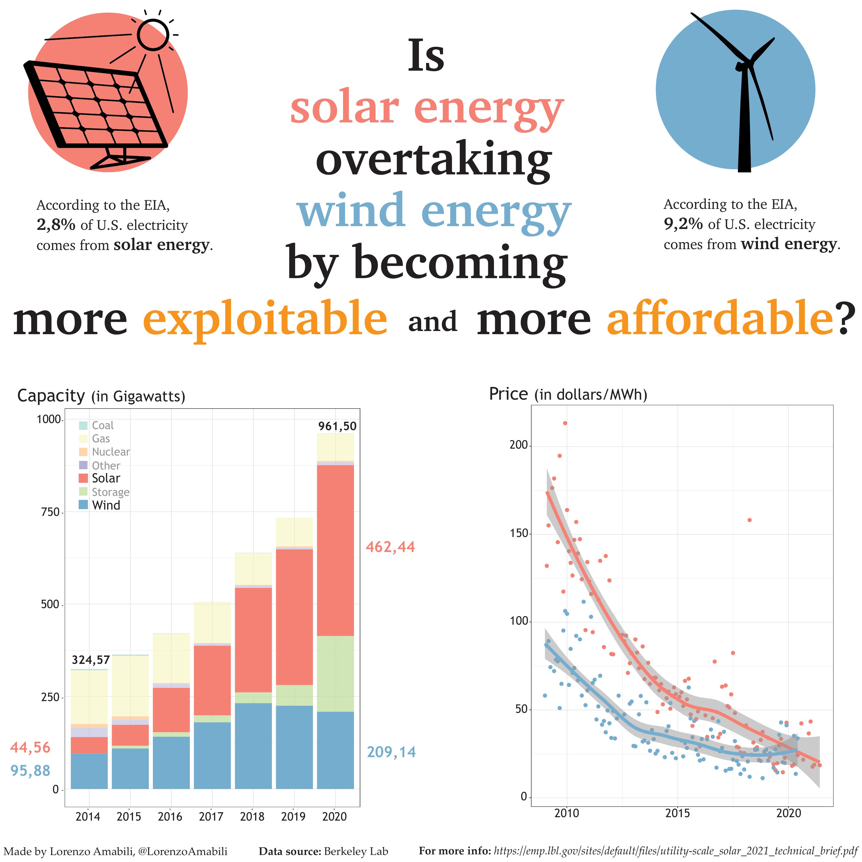
Solar vs Wind Energy

Data visualisation made for the TidyTuesday contest.
Made by using R (ggplot2) and Adobe Illustrator.


view it. see the code.

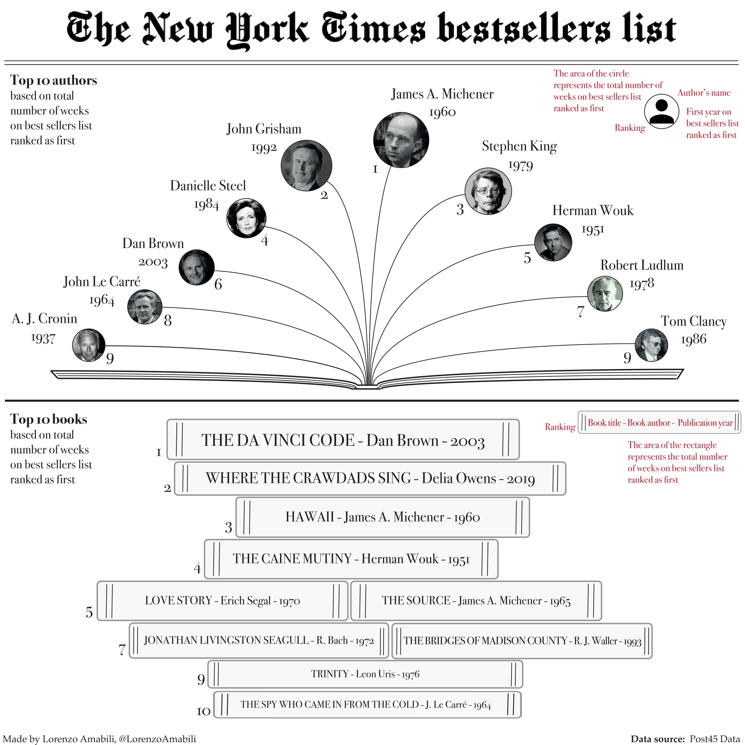
The NY Times Bestsellers

Data visualisation made for the TidyTuesday contest.
Made by using R (ggplot2) and Adobe Illustrator.


view it. see the code.

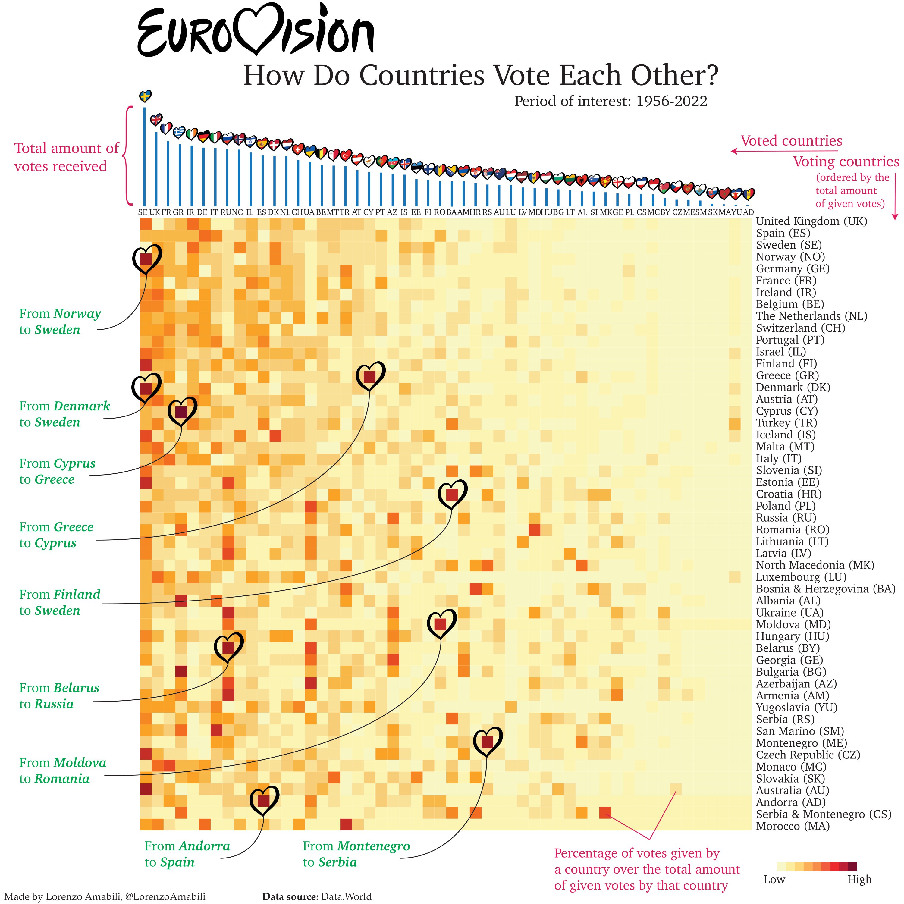
The Eurovision Voting

Data visualisation made for the TidyTuesday contest.
Made by using R (ggplot2) and Adobe Illustrator.


view it. see the code.

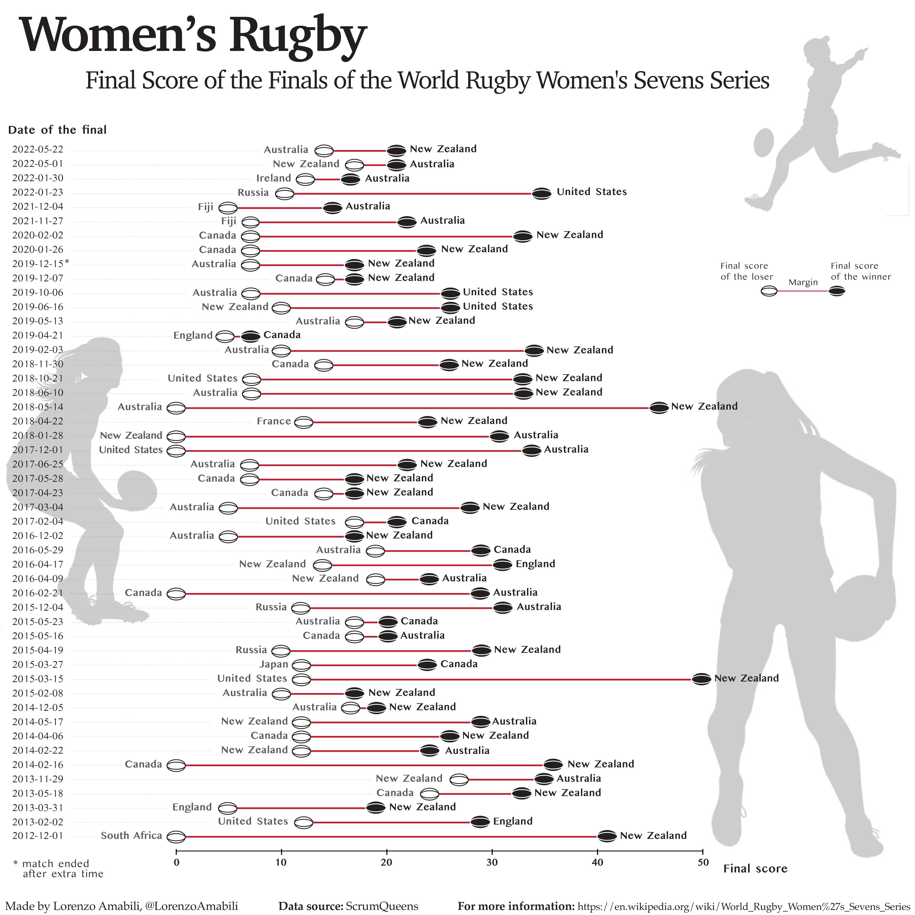
Learning about Women's Rugby

Data visualisation made for the TidyTuesday contest.
Made by using R (ggplot2) and Adobe Illustrator.


view it. see the code.

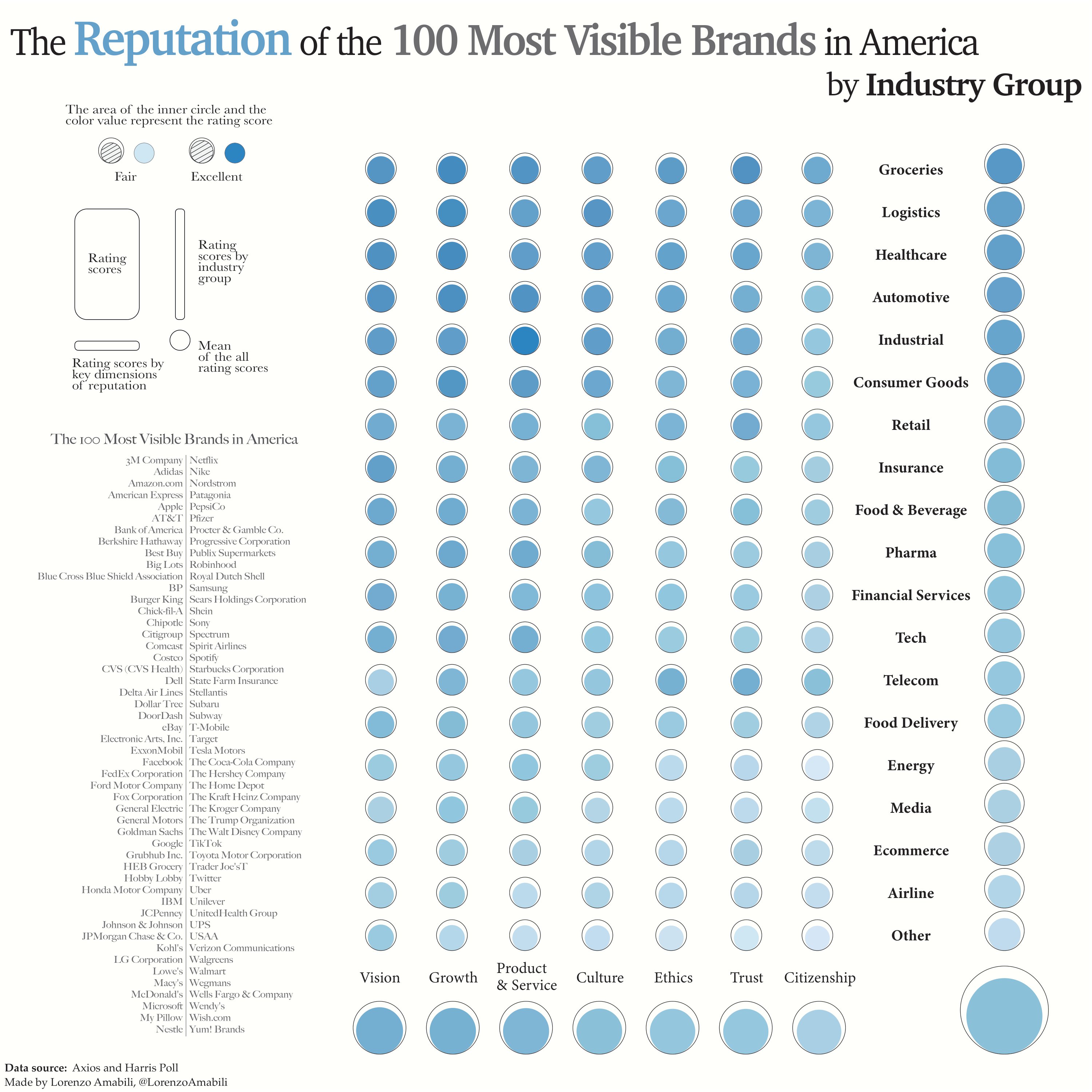
Analyzing Brands' Reputation

Data visualisation made for the TidyTuesday contest.
Made by using R (ggplot2) and Adobe Illustrator.


view it. see the code.

Contact